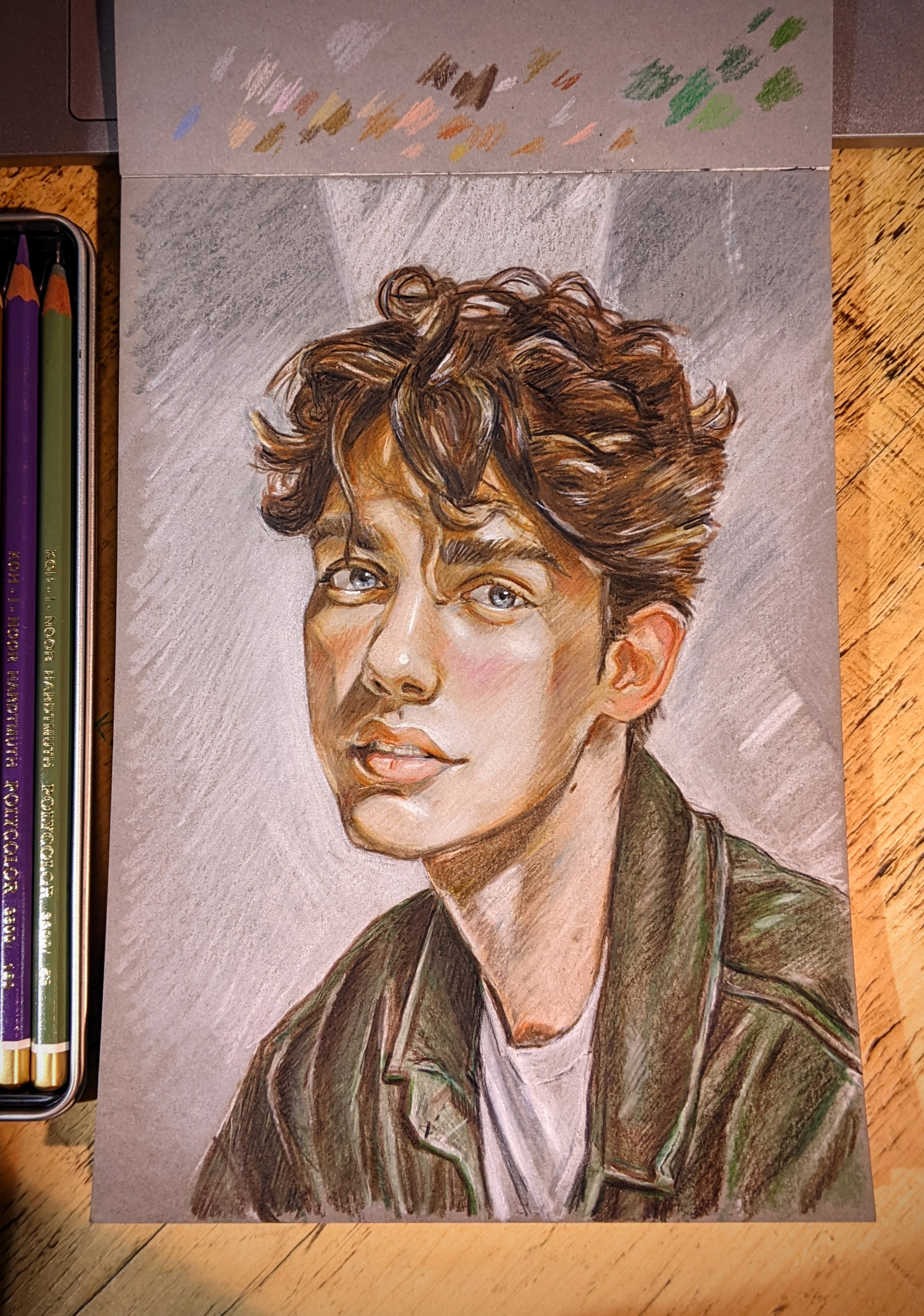
Photo study of George Pomogisebe
Drawn using Koh-i-Noor Hardtmuth PolyColour 24 portrait pencils, and Claire Fontaine Paint on Mixed Media / Multi Techniques Gris grey paper, A5.


Photo study of George Pomogisebe
Drawn using Koh-i-Noor Hardtmuth PolyColour 24 portrait pencils, and Claire Fontaine Paint on Mixed Media / Multi Techniques Gris grey paper, A5.

Found a nice photo from the 1920’s that I thought would be good fun to draw.
Claire Fontaine multi technique gris pad
KOH-I-NOOR HARDTMUTH Polycolor monochrome / grey pencils.
Also a few other bits used include the silver Staedtler Metallic Pen for the shiny parts of the dress and headdress sparkles.

So I watched Cleopatra last week with Elizabeth Taylor and really enjoyed it. The set design, costumes, everything was amazing, and it took them 10 years for the film to break even because it cost that much. Definitely worth it though, and I’ve really enjoyed drawing this, I may retire now 😅
I probably should’ve done a white wash under the gold just to make the metallic pop more but it was too late, oh well.
Stuff used;
Claire Fontaine Paint On Mix Media grey pad, A5.
Faber-Castell Polychromos colour pencils.
Staedtler Metallic Pens.
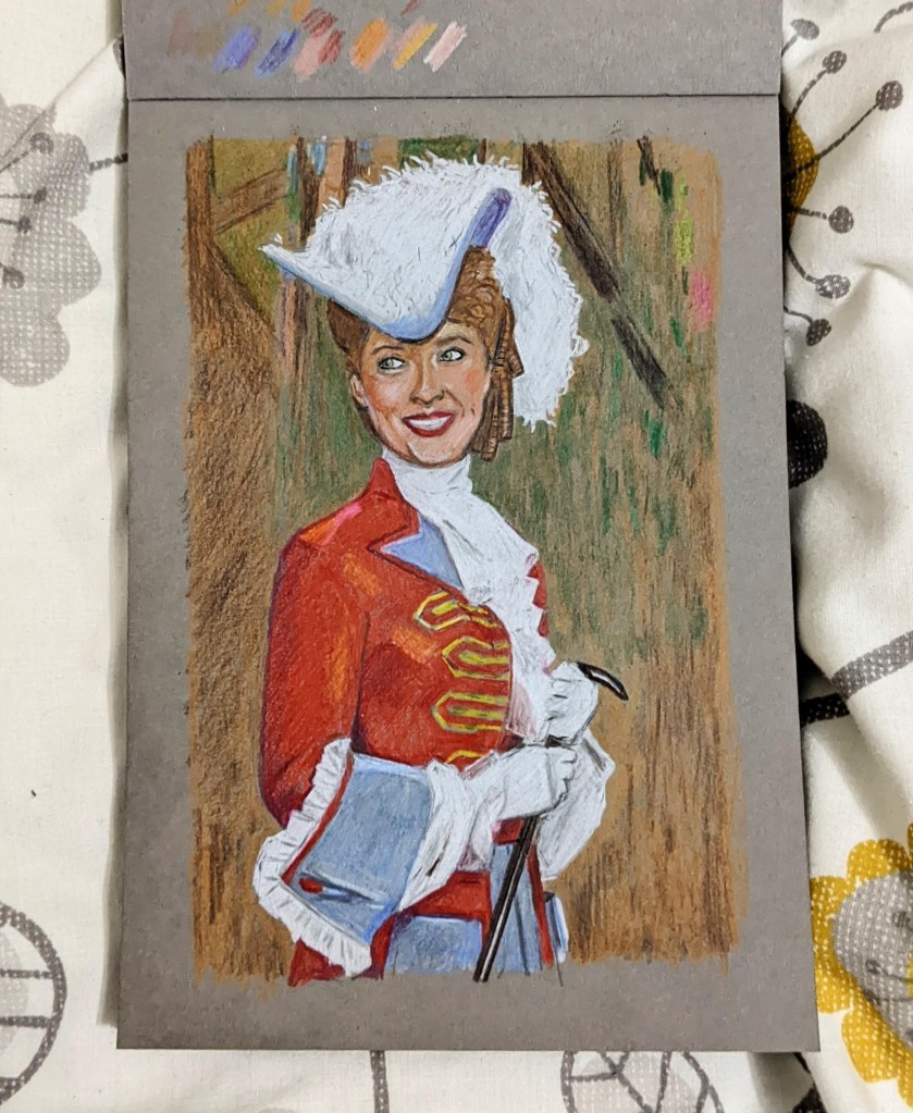
I watched The Phantom of the Opera (1943) last week and the opening shots were of Susanna Foster in this beautiful red coat, it stuck with me and I just had to draw it 😂
Claire Fontaine multi technique gris pad and Faber-Castell polychromos pencils.

Another practice drawing for the sketchbook. Claire Fontaine multi technique pad and KOH-I-NOOR Hardtmuth Polycolor pencils.
Reference from Pinterest.
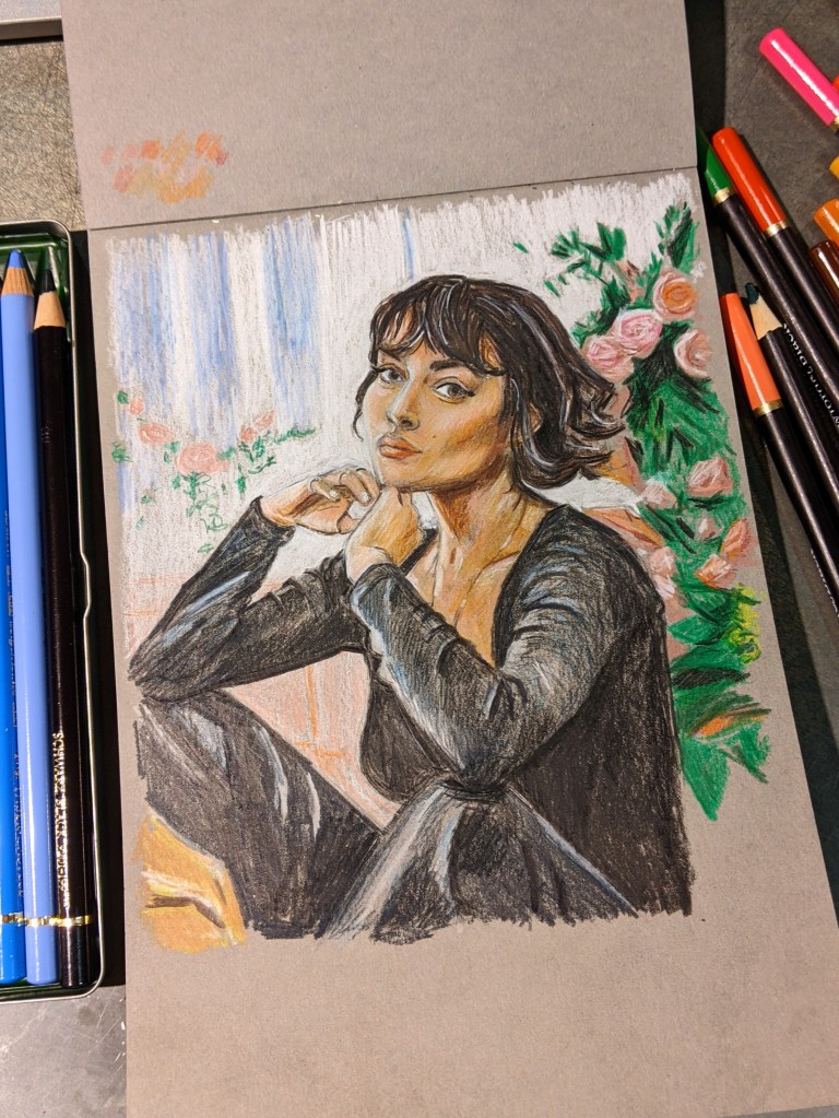
I’d been moving away from just doing portrait studies, and wanted to do some wider drawings too, and doing a scene in colour seemed nice, especially after enjoying the previous one in black and white. It didn’t quite come out how I wanted it, but there’s still limitations to drawing like this (mostly in pencil, with the skin base layer and roses done with my brush pens)


First study with the monotone/grey pencils on the grey paper. Would get slightly more range on white paper but there’s more warm and cool grey pencils available so I could always get a bigger range. I do like this paper though, and I’m looking forward to doing some colour pencils on it, as well as maybe ink and mixed media!
Pad is Paint On Mix Media Gris, by Claire Fontaine.
Pencils are Polycolor by KOH-I-NOOR Hardtmuth.
Photo from Pinterest of Lidia Savoderova

Another one, not perfect but happy. I’m tempted to try and find monochrome white to black with grey pencils, so I have a little more range of tones to blend etc. As the lightest grey pen I have is great, but the one above that is a bit too dark so I’m struggling to get a full range of tones. Plus the darker tones in this pen set have a blue hue to them, no big deal but hopefully will be able to find something. I know I can get pastels in monochrome scale, but they’re a bit messy and won’t work with the other materials as well. I could do the odd one with paints as the base but it’s less practical. Might do a full colour one next

I struggled to get the likeness on this study, but it’s almost there!


I picked up this grey tone mixed media A5 pad the other day (£6.50, by Claire Fontaine), and some grey brush pens. Going to try something a little different. Was going to be all black and white values, however the colour pencil crayons I have are really nice and vibrant on this so I’m just going to have fun with it
